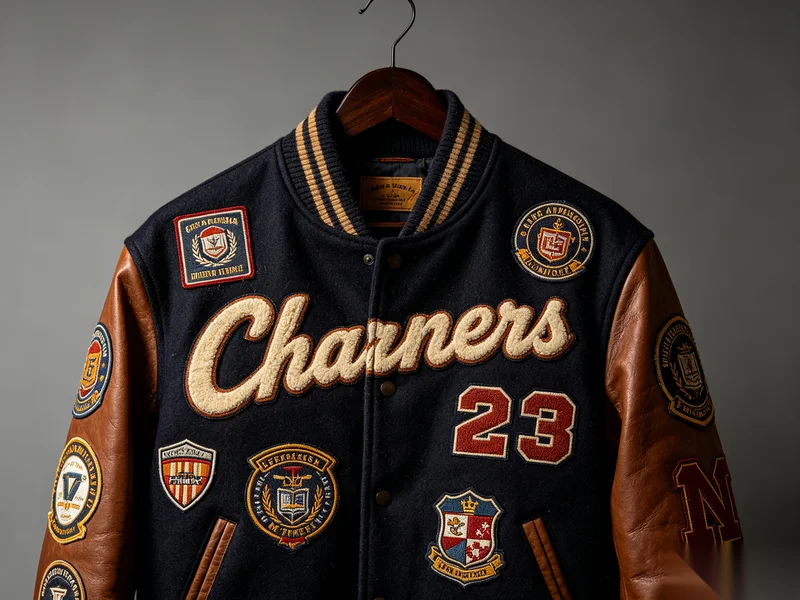
Uneven color in small text on custom text labels is usually caused by limitations in woven label production. To reduce this issue, ensure text height is at least 1.5–2 mm, avoid ultra-thin lines, use simple color combinations, and choose high-density weaving or alternative processes like printed labels.
What Causes Uneven Color in Small Text on Woven Labels?
In the production of custom text labels, especially woven labels, small text or fine lines may sometimes appear:
- Slightly faded
- Broken or discontinuous
- Inconsistent in color intensity
This is not necessarily a production defect, but rather a technical limitation of the weaving process.
Main Reasons Behind the Issue
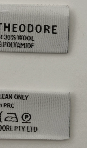
1. Text Size Is Too Small
Woven labels are created by interlacing yarns, not printing ink.
When text becomes too small, the yarn cannot fully reproduce the design details.
2. Lines Are Too Thin
Very fine lines can lead to:
- Skipped stitches
- Incomplete coverage
- Broken visual appearance
This results in uneven or discontinuous color.
3. Strong Color Contrast
When high-contrast colors (such as white text on a black background) are used in very small sizes, any slight imperfection becomes more visible.
4. Weaving Density Limitations
If the weaving density is not high enough:
- Fine details become blurred
- Small text loses clarity
- Color appears less consistent
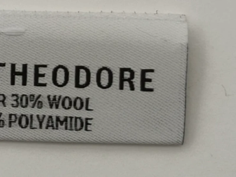
How to Improve Small Text Quality in Custom Text Labels
1️⃣ Design Optimization (Most Important)
- Recommended text height: ≥ 1.5 mm (ideally ≥ 2 mm)
- Slightly increase line thickness
- Avoid overly complex or detailed fonts
👉 A cleaner design always produces better woven results.
2️⃣ Color Optimization
- Use single-color text whenever possible
- Avoid high-contrast combinations for very small text
This helps reduce the visibility of minor inconsistencies.
3️⃣ Process Optimization
- Choose high-density weaving
- Use weaving structures suitable for fine details (such as satin weave)
These methods improve clarity and color consistency.
4️⃣ Alternative Solutions for Very Small Text
If the text is extremely small, consider:
- Printed labels (Printed Labels)
- Woven + printing combination labels
These options can achieve higher precision for fine details.
5️⃣ Pre-Production Sampling
- Always provide a pre-production sample for approval
- Clearly communicate that slight unevenness in very small text is within normal process tolerance
This step helps align expectations and avoid misunderstandings.
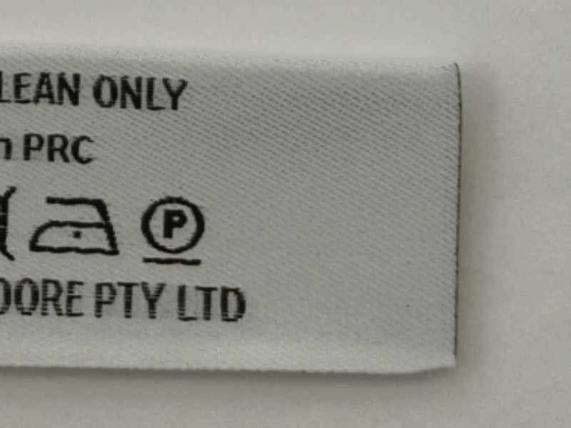
Final Thoughts on Custom Text Labels
By optimizing text size, line thickness, color selection, and production methods, the risk of uneven color can be significantly reduced.
However, due to the inherent nature of woven labels:
This issue cannot be completely eliminated, only minimized.
Understanding these limitations early in the design stage is the key to achieving the best possible result for your custom text labels.
About Author
——————————————————————————————————————————————

Mary
Sales Manager
Hi, I’m Mary. Passionate about exploring new industry trends, I stay ahead of the curve and offer clients forward-thinking solutions tailored to their needs.
——————————————————————————————————————————————