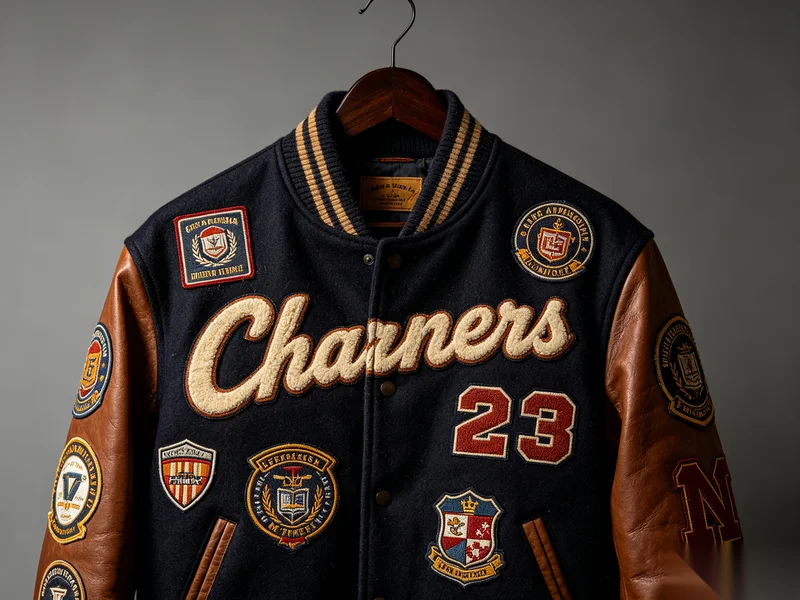
A Distressed Kraft Paper Hangtag with secondary printing requires precise material selection, multi-step color matching, and customized printing plates. When original kraft paper colors cannot be directly sourced, layered printing and controlled irregular distress techniques are essential to closely replicate customer-supplied samples.
What Is a Distressed Kraft Paper Hangtag?
A Distressed Kraft Paper Hangtag is typically made from washed kraft paper and enhanced through:
- Secondary surface printing
- Intentional color contrast between base paper and printed layers
- Irregular, aged, or worn visual effects
This type of hangtag is widely used by brands seeking:
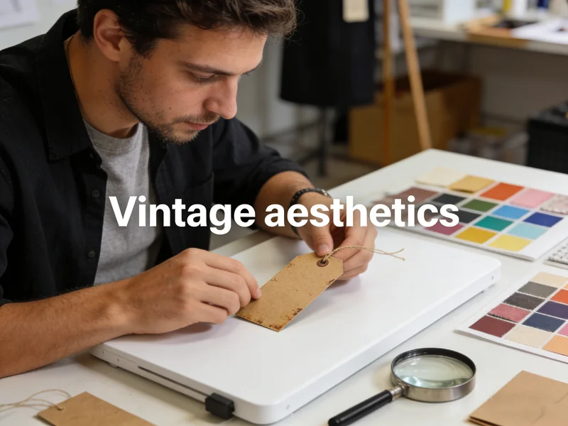
- Vintage aesthetics
- Natural, handcrafted visual language
- Authentic, worn-in brand storytelling

Customer Background: Secondary Printing on Washed Kraft Paper
In this case, the customer provided a physical hangtag sample, not just artwork.
Key characteristics of the sample:
- Base material: Washed kraft paper
- The surface color was different from the natural kraft base
- The distressed effect was irregular and non-repeating
- Overall appearance required a naturally aged look, not a clean print
This immediately indicated that the tag was not produced using single-step printing.
What Was the First Technical Challenge?
Challenge 1: No Matching Base Kraft Paper Material
After extensive sourcing and internal engineering review:
- No washed kraft paper material matched the exact surface tone of the customer’s sample
- Existing kraft materials were either:
- Too light
- Too warm
- Too cool in undertone
Direct replacement was not possible.
How Did We Solve the Kraft Paper Color Issue?
Step 1: Select the Closest Base Material
Instead of forcing an imperfect match, we:
- Selected the closest possible washed kraft paper base color
- Treated it as a printing substrate, not a finished color
This approach allowed flexibility without compromising material texture.
Step 2: Secondary Printing with Layered Color Matching
To replicate the sample’s surface tone:
- Multiple rounds of color adjustment printing were applied
- Each print layer was calibrated to:
- Adjust warmth and saturation
- Maintain paper fiber visibility
- Avoid covering the natural kraft texture
This secondary printing process ultimately achieved a surface color highly consistent with the customer’s original sample.
What Was the Second Major Difficulty?
Challenge 2: Irregular Distressed Printing Effects
The customer also required:
- Non-uniform distressed shapes
- Random, aged visual marks
- No mechanical repetition
However, distressed effects are inherently:
- Random
- Non-fixed in shape
- Difficult to control with standard printing
Using conventional printing methods would result in:
- Repetitive patterns
- Artificial-looking distress
- Inconsistent brand presentation
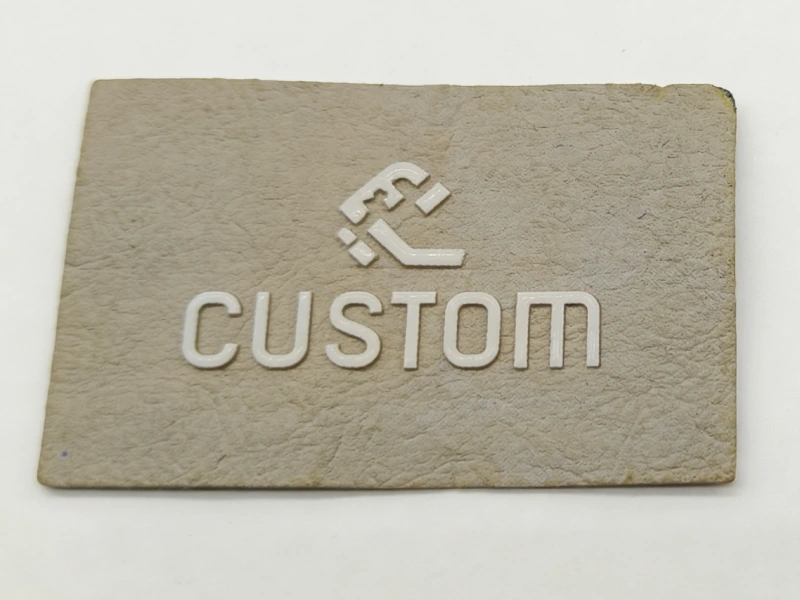
How Was the Distressed Effect Successfully Replicated?
Customized Plate Development
Instead of generic distress textures, we:
- Studied the exact distressed shapes on the customer’s physical sample
- Used those shapes as references
- Developed a custom film screen (printing plate) specifically for the distressed areas
This allowed:
- Controlled randomness
- Consistent reproduction across batches
- Visual authenticity without chaos
Precision Color Printing on Distressed Areas
Once the custom plate was completed:
- Distressed areas were printed with precise color control
- Ink density was carefully adjusted to:
- Look worn, not dirty
- Blend naturally into the kraft base
- Preserve fiber texture
Final Result: High Consistency with Customer Sample
The finished Distressed Kraft Paper Hangtag achieved:
- Surface color closely matching the provided sample
- Natural-looking, irregular distress patterns
- Balanced color layers without overpowering the kraft texture
From a visual, tactile, and structural standpoint, the final product was highly consistent with the original physical sample.
Why This Process Matters for Brands
Key Takeaways for B2B Buyers
- Washed kraft paper colors are not fully standardized
- Secondary printing is often required for exact color matching
- Distressed effects need controlled randomness
- Custom printing plates ensure consistency at scale
- Physical samples provide critical development accuracy
FAQ: Distressed Kraft Paper Hangtags
Q: Can distressed effects be perfectly identical on every hangtag?
No. The goal is controlled variation, not exact repetition.
Q: Is secondary printing always necessary?
Only when the base kraft material cannot naturally match the desired surface color.
Q: Does distressed printing increase cost?
Yes, due to custom plate development and additional printing steps—but it significantly improves visual authenticity.
Conclusion: Distress Is a Process, Not a Preset
A high-quality Distressed Kraft Paper Hangtag is not achieved by a single material choice or standard print setting.
It requires:
- Material understanding
- Engineering evaluation
- Layered color strategy
- Controlled irregularity
When done correctly, the result is not just a hangtag—but a tactile extension of the brand’s identity, balancing precision with imperfection.
About Author
——————————————————————————————————————————————

Mary
Sales Manager
Hi, I’m Mary. Passionate about exploring new industry trends, I stay ahead of the curve and offer clients forward-thinking solutions tailored to their needs.
——————————————————————————————————————————————