In the world of custom embroidered patches, color accuracy is one of the most important — and most challenging — parts of the production process.
Many brands and designers have faced this frustrating scenario: the digital mockup looks vibrant and balanced, but the finished embroidery appears darker, duller, or slightly off from the expected hue.
So, why does color distortion happen in embroidery?
And, more importantly, how can you ensure that your embroidered patches perfectly match your brand’s Pantone color?
This article will explain everything you need to know about color management in custom embroidery, from understanding material limitations to communicating accurate color references with your manufacturer.

1️⃣ Why Do Embroidered Patch Colors Look Different?
Even with advanced embroidery machines and premium thread brands, achieving perfect color consistency isn’t easy. Several factors can cause color mismatch or visual distortion during production.
1. The difference between thread colors and digital colors
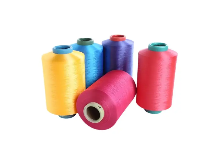
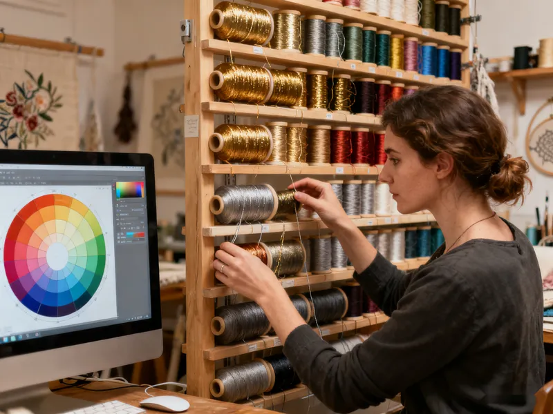
Computer screens use RGB light to display colors, while embroidery threads are dyed with physical pigments that reflect light.
This means the color you see on your monitor may not look identical when stitched with actual thread.
Metallic threads, matte finishes, and texture can all alter perceived brightness and tone.

2. Fabric base and surface reflection
The same thread color can appear slightly different depending on the background fabric — for instance, a white twill base reflects light and makes the thread appear brighter, while a black felt background absorbs light and makes it look darker.
Textured fabrics like canvas or denim also affect the way colors appear under different lighting.
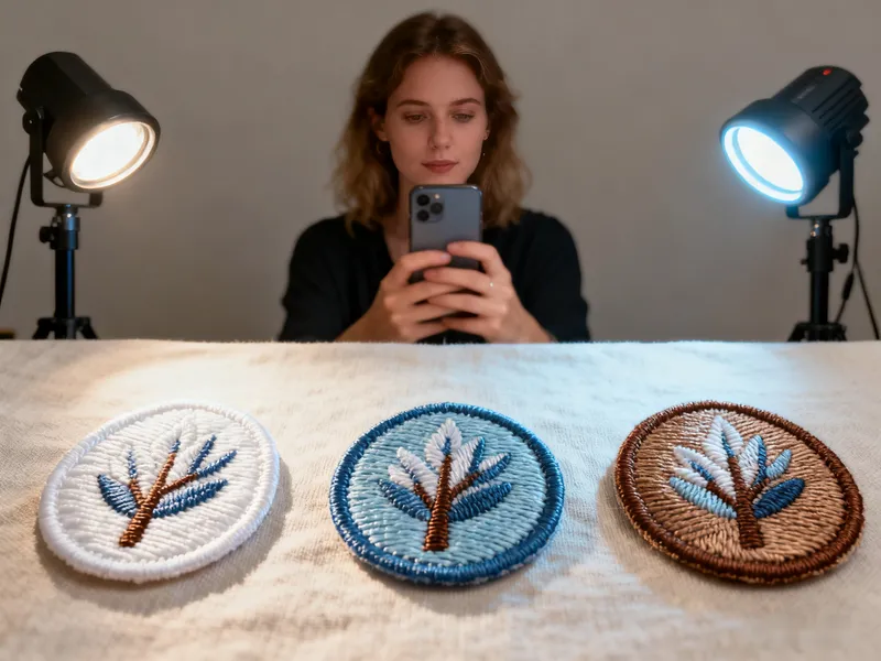
3. Lighting conditions
Natural sunlight, fluorescent lights, and LED lights all have different color temperatures.
If your sample is reviewed in one lighting environment and the final product is displayed in another, your perception of color may change dramatically.
4. Lack of a standardized color reference
Without a consistent reference system, such as Pantone color codes, color decisions become subjective.
Terms like “bright red” or “sky blue” can easily be misinterpreted between designer and production teams.
2️⃣ How to Control Colors in Embroidery Production
Fortunately, there are several professional techniques to ensure that your embroidered patches match Pantone colors as closely as possible.
These steps are widely used in apparel accessory production and help minimize communication gaps between designers and embroidery factories.
✅ 1. Always use Pantone color codes as your reference
The Pantone Matching System (PMS) is the global standard for color communication.
When submitting your embroidery design or logo, always label each color area with its specific Pantone code.
For example:
- Red: Pantone 186C
- Blue: Pantone 286C
- Yellow: Pantone 123C
Your embroidery supplier can then refer to a Pantone-to-thread conversion chart to select the closest available thread color.
This dramatically reduces the risk of color deviation between digital artwork and the final product.
💡 Pro Tip: Always specify whether you’re using Pantone Coated (C) or Uncoated (U) codes, as these can appear slightly different.
✅ 2. Provide physical samples or high-quality reference photos
If your design involves unique shades — metallic gold, gradient tones, or custom textures — it’s best to send a physical color sample or a high-resolution photograph under neutral lighting.
An experienced embroidery digitizer can compare your reference across lighting conditions and select threads that reproduce the same tone and finish.
This method is especially effective when matching corporate brand colors or reproducing gradients in patch designs.
✅ 3. Confirm the thread brand and color system
Different embroidery thread brands use their own color libraries, and even when two threads look similar on screen, they may differ in real life.
Common professional brands include Madeira, Gunold, Isacord, and DMC, each with its own numbering system.
When working with your supplier, always confirm:
- Which thread brand will be used
- The color number or code for each area
- Whether substitutions will occur if exact matches aren’t available
This small step helps maintain consistency, especially in repeat or large-batch orders.
✅ 4. Always approve a physical sample before mass production
The sample approval stage (also called the “strike-off” or “pre-production sample”) is essential.
Before producing your entire batch, your supplier should provide a stitched sample patch using the selected thread colors.
You should review this sample in both natural light and artificial light to confirm that the color matches your expectations.
If there’s even a slight deviation, adjustments can be made before full production begins — saving you time, cost, and potential rework.
✅ 5. Keep production records and internal color archives
For consistent long-term branding, maintain a database of your approved embroidery colors, including:
- Pantone number
- Thread brand and code
- Production date and batch number
- Fabric type used
This internal record ensures that future patch reorders perfectly match previous production runs, even if you change suppliers.
3️⃣ Pro Tips for Managing Color in Embroidered Patches
Here are some additional professional techniques embroidery designers and factories use to maintain color integrity:
1. Control lighting during photo and sample review
Use lighting with a neutral white balance (around 5500K color temperature) when reviewing or photographing patches.
This simulates daylight and ensures your perception of color remains accurate.
2. Avoid compressed or filtered images
When you send digital references, avoid heavily compressed JPEGs or screenshots, as these can distort colors.
Whenever possible, use vector files (AI, EPS, PDF) with Pantone codes embedded.
3. Use precise communication — not subjective color names
Avoid using vague descriptions like “light red” or “sky blue.” Instead, refer directly to the Pantone number or the thread code.
Clear communication prevents misunderstandings between design and production teams.
4. Clarify color expectations for international clients
If your customers use different color systems such as RGB, CMYK, or Hex codes, make sure to convert them to Pantone values before embroidery digitizing.
This ensures a unified reference for both the design and manufacturing teams.
4️⃣ Case Study: The Importance of Color Verification
A clothing brand once submitted a logo design for embroidered patches using only an RGB file.
During sampling, the final product appeared much darker than expected — the red tone looked almost burgundy instead of bright red.
To fix the issue, the client provided a physical Pantone 186C sample card.
The embroidery factory matched the color using Madeira thread reference and produced a new sample.
The second version achieved a 95% color accuracy compared to the digital mockup.
The lesson? Accurate color communication is the foundation of professional embroidery production.

5️⃣ Key Takeaways: Keeping Your Embroidery Colors True
Color accuracy in embroidery isn’t about luck — it’s about process control.
To prevent color distortion and ensure perfect consistency across every patch order, remember these three golden rules:
✔ Use Pantone color codes
Pantone standards provide a universal color language that bridges the gap between designers and manufacturers.
✔ Provide physical references
A real-world sample or high-quality photo ensures your production team understands your expectations.
✔ Approve samples before mass production
Testing colors under different lighting conditions before full production guarantees color consistency and brand integrity.
6️⃣ Final Thoughts — Bring Your Brand Colors to Life in Embroidery
Embroidery is a tactile, visual art — the interplay of thread, fabric, and light creates the unique beauty that digital printing can’t replicate.
However, without proper color management, even the most detailed designs can lose their intended impact.
By standardizing your workflow with Pantone codes, physical samples, and sample verification, you can achieve precise, repeatable results for every batch of custom embroidered patches.
Whether you’re creating corporate logos, fashion labels, or uniform badges, mastering color control will help your brand appear more professional, cohesive, and visually striking.
About Author
——————————————————————————————————————————————

Apollo
Senior E-commerce Manager
Apollo is an experienced e-commerce manager specializing in patches, apparel accessories, and digital marketing, helping global textile brands grow with proven online strategies.
——————————————————————————————————————————————