When designing embroidered patches, many brands focus mainly on colors and visual style. However, size limitations in computer embroidery are just as important.
If the design contains very small text or detailed icons, the final embroidery result may not match the original artwork. Understanding these limitations early can help avoid redesigns, production delays, or unsatisfactory results.
Here is a real example from one of our recent projects.
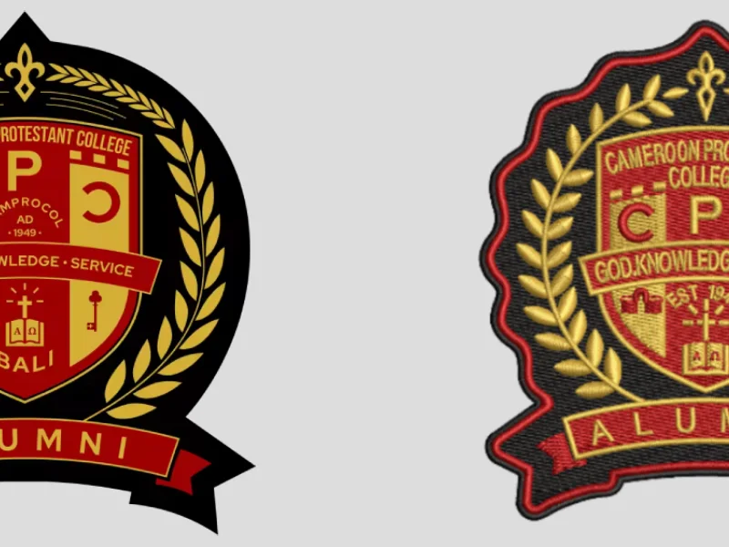
A Custom Embroidered Patch for School Uniform Blazers
A client who owns a tailoring shop contacted us to produce embroidered chest patches for a batch of high-quality school uniforms.
The client provided:
- The official school crest design
- Reference sample photos
- Patch size: 8.5 cm (W) × 10 cm (H)
- Fabric: 75% worsted wool blend, used for formal school blazers
Because the patch needed to reflect the traditional and premium look of the uniforms, we recommended using full embroidery coverage. For the wheat elements in the crest, we proposed using gold metallic embroidery thread to enhance the visual quality and texture.
Choosing the Right Attachment Method
Another important question was how to attach the patch to the blazer.
The client had two concerns:
- Heat transfer only might risk long-term detachment
- Sewing only might cause the center of the patch to lift or float
After evaluating the design and fabric, we recommended a combined solution:
✔ Heat transfer backing for initial positioning
✔ Sewing around the edges for long-term stability
This method ensures both durability and a clean, professional appearance.
The Key Challenge: Small Letters and Icons
The biggest issue in this project was the small text and detailed icons in the center of the crest.
Our embroidery machines have practical technical limitations that must be respected during production.
For computer embroidery patches, the general requirements are:
- Minimum letter and icon height: 4 mm
- Minimum spacing between letters: 0.7 mm
If the design goes below these limits, the embroidery machine can only produce the details using single-line stitching.
However, single-line embroidery usually looks:
- Thin
- Inconsistent
- Less refined compared to standard embroidery stitching
For a formal blazer crest, this would significantly reduce the overall quality.

Why Simpler Designs Work Better for Embroidery
Because of these limitations, we recommended that the client simplify some of the smaller letters and graphic elements in the crest design.
In embroidery production, a general rule applies:
The cleaner and more simplified the patch design, the better the final embroidery result.
Overly small or complex details may not translate well into stitches and can lead to blurred or unclear visuals.

Final Advice for Designing Embroidered Patches
When creating artwork for embroidered patches, it is important to keep technical limitations in mind.
Key recommendations:
- Keep text height above 4 mm
- Maintain at least 0.7 mm spacing between letters
- Avoid overly complex icons or extremely fine details
- Simplify artwork whenever possible
Following these guidelines ensures that the final embroidered patch looks sharp, professional, and durable.
If you are designing embroidered patches for uniforms, fashion brands, or promotional products, consulting the embroidery specifications early in the process can help ensure the final product matches your expectations.
About Author
——————————————————————————————————————————————

Laurie
Sales Manager
Hi, I’m Laurie, Sales Manager. I am detail-oriented and highly responsible, focusing on understanding clients’ real needs and delivering reliable solutions while building long-term, trusted partnerships.
——————————————————————————————————————————————