Many customers encounter a common question when developing custom apparel trims:
Why do woven labels and embroidery look slightly different even when they use the same Pantone color?
This does not necessarily mean there is a production problem.
In apparel trim development, pantone color matching provides an important color reference for brands, designers, and manufacturers. However, different materials, yarns, production methods, surface textures, and levels of gloss can all affect the final appearance of a color.
In other words, the same Pantone color does not always look exactly the same across different types of apparel trims.
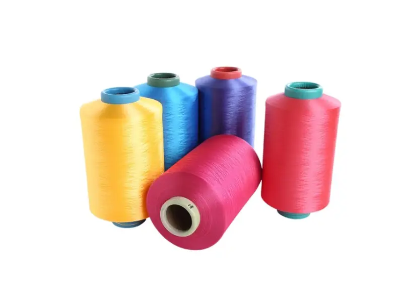
Different Manufacturing Processes Create Different Color Effects
Woven labels and embroidered patches can both use dyed yarn, but their structures and manufacturing processes are completely different.
A dokuma etiket is created by interweaving warp and weft yarns to form the design. The final color can be affected by yarn density, weaving structure, yarn thickness, and surface gloss.
Nakış, on the other hand, uses embroidery thread stitched onto the surface of a fabric. Stitch direction, thread coverage, thread thickness, and thread gloss can all influence how the color appears.
Therefore, even when both products are matched to the same Pantone reference, the final visual appearance may still vary slightly.
A simple way to understand this is:
Same color standard + different material and manufacturing process ≠ exactly the same visual color.
It is similar to applying the same paint to wood, metal, and plastic. The paint itself has not changed, but the surface underneath changes how the color is perceived.
Why Can Slight Color Differences Occur Within the Same Product?
Even when comparing products made using the same process, slight color variation can occur between different production batches.
This is because textile yarns are dyed materials, and dyeing naturally involves a certain level of manufacturing tolerance.
Common factors include:
- Different yarn batches
- Different dye lots
- Yarn gloss and surface finish
- Yarn thickness
- Dokuma yoğunluğu
- Base fabric color
- Production conditions
In the textile industry, slight differences between dye lots are commonly referred to as dye lot variation.
For brands with strict color requirements, it is therefore preferable to use yarn or materials from the same dye lot whenever possible rather than simply providing the same Pantone number for every production run.
What Is the Role of Pantone Color Matching?
Pantone color matching remains an important tool for color communication.
Its main purpose is to provide brands, designers, and manufacturers with a standardized color reference. It does not guarantee that every material will display exactly the same visual color.
For example, if a customer specifies a particular Pantone color, the manufacturer can use that reference to select and adjust the appropriate yarn, ink, silicone, TPU, or other material.
However, different manufacturing processes require different approaches to color matching.
Profesyonel pantone color matching should therefore consider:
Pantone color + material + manufacturing process + surface finish + physical sample
This approach provides a much more realistic representation of the final product.
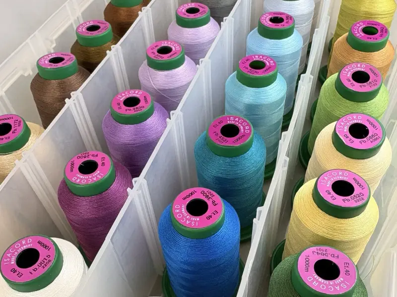
Visual Consistency Is More Important Than Absolute Color Identity
If a garment uses woven labels, embroidery, silicone patches, TPU patches, and other trims at the same time, requiring every product to have a mathematically identical color may not always produce the best visual result.
Örneğin:
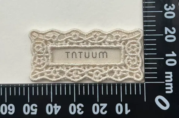
- Woven labels may have a visible yarn texture and subtle sheen.
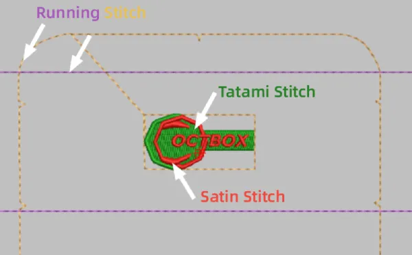
- Nakış has a distinctive thread texture and stitch direction.
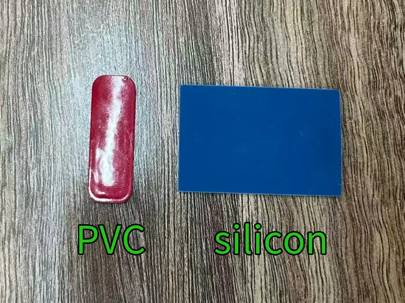
- Silikon yamalar generally have a smoother surface.
- TPU patches can have different levels of transparency and gloss.
- Printed trims are influenced by the ink and substrate.
Even when all these products are matched to the same Pantone reference, their surfaces interact with light differently.
As a result, the colors may look slightly different to the human eye.
For apparel brands, the more important goal is often visual consistency.
The question should not simply be:
“Are all the trims exactly the same color?”
A better question is:
“Do all the trims look visually consistent when they are used together on the same garment?”
This distinction is especially important for premium apparel and multi-trim branding projects.
Physical Samples Are Important for Color Approval
For brands with strict color requirements, it is not recommended to rely solely on digital artwork or colors displayed on a computer monitor.
Different screens, devices, and software settings can display colors differently.
A more reliable development process is:
Pantone reference → Material color matching → Physical sample → Customer approval → Bulk production
This becomes even more important when the same logo is used across multiple products such as woven labels, embroidery patches, silicone badges, TPU patches, and heat transfers.
Ideally, the different trims should be reviewed together during the sampling stage.
This allows potential visual differences to be identified before bulk production rather than after the entire order has been manufactured.
Professional Color Matching Is More Than Finding a Pantone Number
For apparel brands, a Pantone number is only the starting point of color management.
Professional color matching requires an understanding of how different materials and processes affect the final appearance.
For the same brand logo, for example:
- Woven labels may require yarn color adjustment.
- Embroidery may require a specific thread type or gloss level.
- Silicone products may require adjustment of the color pigment ratio.
- TPU products may require consideration of material transparency.
- Printed products may require adjustment based on the ink and substrate.
This is why an experienced trim supplier should do more than simply say:
“We followed the Pantone color.”
A professional supplier should be able to evaluate how that color is likely to appear on the selected material and recommend adjustments during the sampling stage.
FAQ: Pantone Color Matching for Apparel Trims
Can the same Pantone color be used for woven labels and embroidery?
Yes. The same Pantone color can be used as the reference standard. However, differences in yarn, weaving structure, embroidery stitches, and surface gloss may cause slight differences in the final visual appearance.
Why does the same Pantone color look different on different materials?
Different materials have different textures, surface finishes, gloss levels, and light-reflection properties. These factors affect how the human eye perceives the color.
Is slight color variation normal in textile trims?
Yes. Textile yarns are dyed materials, and slight variation between different dye lots is a normal part of textile production.
How can brands improve color consistency?
Brands should provide a Pantone reference and approve physical samples before bulk production. When several types of trims are used on the same garment, they should also be compared together to evaluate overall visual consistency.
Is Pantone matching enough for production?
Pantone is an important color reference, but it cannot completely replace physical sample approval. For projects with strict color requirements, Pantone reference + physical sample approval is a more reliable approach.
Son Düşünceler
The real purpose of pantone color matching is not to make every different material look absolutely identical. Instead, it provides a reliable and standardized reference for communicating color requirements.
Woven labels, embroidery, silicone, TPU, and other apparel trims can look slightly different even when they use the same Pantone color because their materials, structures, textures, and manufacturing processes are different.
A professional color development process should therefore follow:
Pantone Standard → Material Matching → Process Adjustment → Physical Sampling → Visual Approval → Bulk Production
Ultimately, good color matching is not about making every trim look exactly the same.
It is about making all the different trims look unified, coordinated, and consistent with the brand’s overall visual identity.
Yazar Hakkında
——————————————————————————————————————————————

Jason
Satış Müdürü
Kapsamlı sektör bilgim ve sorumlu iş ahlakımla, her müşteri işbirliği için profesyonel rehberlik ve güvenilir destek sunuyorum.
——————————————————————————————————————————————