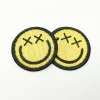
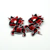
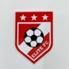
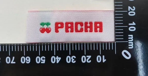
A white logo on a red woven label looks simple on the artwork.
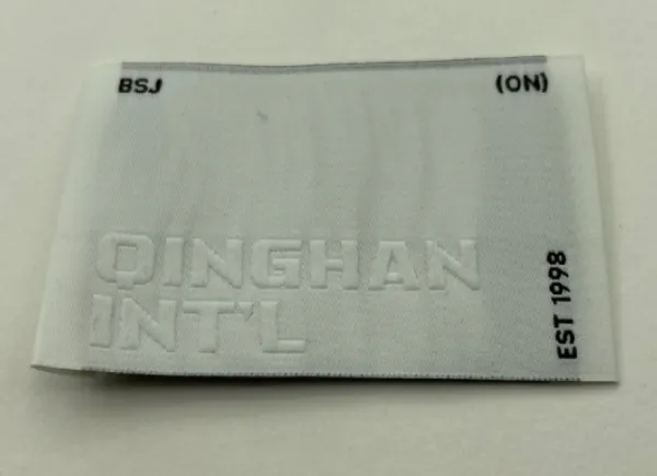
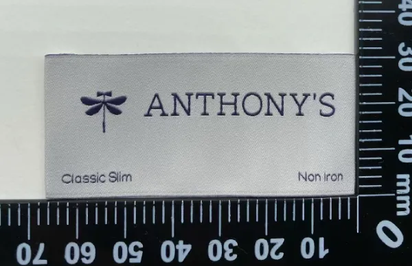
But when the actual sample comes out, the white may not look as clean and bright as expected. It can appear slightly pink, grey, or simply less white.
This is a common issue with high-contrast color combinations, such as white + red, white + black, or white + navy.
So, why does this happen?
Woven Labels Are Not Printed
Unlike printing, woven labels are made by interlacing different colored yarns.
When a light color is woven next to a much darker color, the darker yarn can visually affect the lighter area. This is especially noticeable when the contrast is strong or the white area is small.
For example, in a white and red design, the white may look slightly warmer or pinker than it does on the original artwork.
Can Increasing the Density Help?
Yes, increasing the density can make the lighter area look fuller and reduce the visual influence of the darker yarn.
But higher density is not a perfect solution.
There is a limit to how much it can improve the appearance, especially for small details and thin lines.
More importantly, higher density also means more yarn consumption and a higher production cost.
So the solution is not simply to make the label as dense as possible.
The Real Challenge: Appearance vs. Cost
When developing a high-contrast woven label, we normally look at three things together:
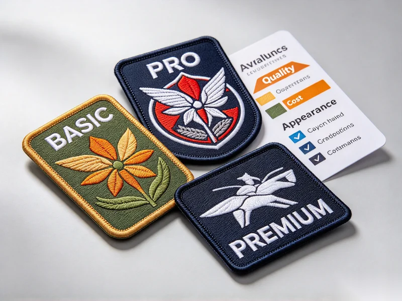
Appearance × Density × Cost
If the customer needs the white to look as clean as possible, we can consider increasing the density or adjusting the weave structure.
If a standard appearance is acceptable, a normal density may already provide a good balance.
For small logos, fine text, or thin lines, adjusting the artwork or weave structure may sometimes be more effective than simply increasing the density.
The goal is to achieve the right visual effect at a reasonable cost.
Why Physical Sampling Matters
This is why physical sampling is important for high-contrast woven labels.
A digital artwork can show a pure white color very clearly, but the actual woven product is created through yarn and weave structure. The final appearance can therefore be different.
A physical sample helps us check:
How the light and dark colors interact
Whether the white looks clean enough
Whether the density needs adjustment
Whether small details remain clear
Whether the improvement is worth the additional cost
Sometimes, a small adjustment to the weave structure can improve the appearance without significantly increasing the cost.
There Is No Single “Best” Density
The highest possible density is not always the best solution.
A better question is:
What density gives us the appearance we need at the right cost?
For different brands, products and quantities, the right solution can be different.
For us, developing a woven label is not simply about reproducing the artwork. We consider the design, colors, size, weave structure, quantity and target cost together.
Because the best solution is not always the most expensive one. It is the one that gives the right result for the application.
Об авторе
——————————————————————————————————————————————

Джейсон
Менеджер по продажам
Обладая обширными отраслевыми знаниями и ответственным отношением к работе, я обеспечиваю профессиональное руководство и надежную поддержку при сотрудничестве с каждым клиентом.
——————————————————————————————————————————————