A PVC label color difference can occur even when a sample is produced using a specified Pantone color. The reason is that color perception depends not only on the color reference but also on material formulation, surface appearance, lighting, and the desired visual effect. In one Italian customer project, QingHan compared three color options and adjusted the original formulation with gold powder to achieve the customer’s preferred golden appearance.
Why Can a PVC Label Look Different From the Specified Pantone Color?
Pantone references provide an important starting point for color matching, but they do not guarantee that every finished product will look identical to a printed color guide or on-screen image.
For custom PVC labels, the final appearance can be influenced by several factors:
- Base color formulation: The pigments and their proportions determine the underlying color.
- Material characteristics: PVC formulation and the finished material’s optical properties can affect how a color is perceived.
- Surface finish: Glossy, matte, textured, or metallic-looking surfaces reflect light differently.
- Special visual effects: Gold powder and other effect materials can change the perceived brightness, depth, and sparkle of a color.
- Lighting conditions: A sample may appear different under daylight, warm indoor lighting, and cool industrial lighting.
These factors are especially important for gold and other colors where the customer expects more than a basic color match. The target may include a particular brightness, warmth, sheen, or metallic-looking appearance.
For this reason, resolving a PVC label color difference requires identifying what looks wrong before changing the color formula.
Case Study: Adjusting the Golden Color of a PVC Label for an Italian Customer
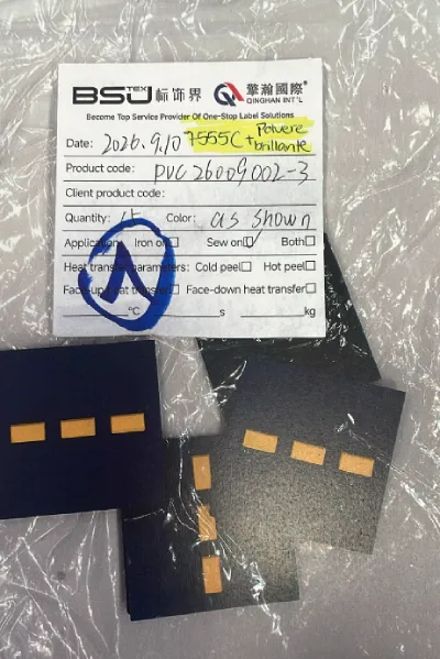
During a bidding project for an Italian customer, the customer specified Pantone 755 C for the raised sections of a custom PVC label.
After the first sample was produced, the customer reviewed the result and found that the raised areas looked too dark. Although the sample had been developed using the specified Pantone reference, it did not deliver the golden appearance the customer expected.
The challenge was not simply to find another Pantone number. We needed to determine whether the problem came from the base color itself or from the overall visual effect.
Step 1: Identify the Actual Color Problem
After receiving the customer’s feedback, we reviewed the difference between the sample and the intended appearance.
The key issue was that the color looked too subdued and lacked the desired golden visual effect. Simply selecting a lighter color would not necessarily solve the problem because the customer wanted a specific golden appearance, not just a higher brightness level.
This distinction matters in custom manufacturing. A color can be technically close to a reference while still looking wrong to the customer because of differences in finish, light reflection, or visual depth.
Before making adjustments, the team therefore focused on understanding the customer’s expectations for the finished PVC label.
Step 2: Develop a Targeted Color Adjustment Plan
Based on the feedback, the engineering team proposed adding an appropriate amount of gold powder to the original Pantone 755 C formulation.
The purpose was to retain the original color direction while enhancing the golden visual effect.
This approach addressed the customer’s concern more directly than changing the base color alone. Rather than treating the issue as a simple light-versus-dark problem, the team considered both the underlying color and the surface appearance.
The exact formulation still needed to be verified through physical samples. Adding an effect material can change the appearance in ways that are difficult to evaluate from a color code alone.
Step 3: Produce Three Color Options for Comparison
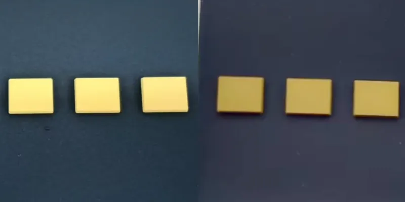
To identify the most suitable solution, we prepared three alternatives for the customer to review.
| Option | مخطط الألوان | غاية |
|---|---|---|
| أ | Pantone 755 C + gold powder | Enhance the golden visual effect while retaining the original color direction |
| B | Pantone 7562 C | Evaluate an alternative Pantone color |
| ج | Pantone 755 C without gold powder | Use the original color formulation as a reference |
Comparing these options made it easier to evaluate the differences in color depth and overall appearance.
The samples provided a practical basis for decision-making. Instead of asking the customer to choose based on color codes or descriptions alone, we could compare the actual PVC label samples side by side.
Step 4: Refine the Samples and Confirm the Final Choice
The project went through two rounds of sample development, including multiple color adjustments.
After reviewing the alternatives, the customer ultimately approved Pantone 755 C + gold powder.
This result showed that the original Pantone reference did not necessarily need to be abandoned. By adjusting the visual effect of the material, we were able to move closer to the customer’s intended appearance while retaining the original color direction.
The final decision was based on physical sample approval rather than the Pantone number alone.
For production consistency, the approved sample should be retained as a visual reference, together with the relevant color formulation and process specifications. This helps the production team work toward the agreed appearance during subsequent manufacturing.
How to Solve a PVC Label Color Difference: A Practical Checklist
When a custom PVC label does not match the expected color, the following process can help identify the cause and reduce unnecessary sampling.
1. Define the Difference Clearly
Start by describing what looks different. Is the sample too dark, too light, too warm, too cool, or missing the expected gloss or metallic-looking effect?
Specific feedback is more useful than saying that the color is simply wrong.
For example, “The raised gold areas look too dark and lack the desired golden effect” gives the engineering team a clearer direction than “The color does not match.”
2. Compare Samples Under Consistent Lighting
Whenever possible, compare the sample with the approved color reference under the same lighting conditions.
Avoid evaluating one sample under warm indoor lighting and another under daylight. Different light sources can change the perceived relationship between colors.
For important projects, it is also useful to document the viewing conditions and use the same setup when reviewing subsequent samples.
3. Separate Base Color From Surface Appearance
Determine whether the main issue is the underlying color or the way the surface reflects light.
If the color is fundamentally incorrect, adjusting the pigment formulation or selecting another color reference may be appropriate. If the base color is close but the result lacks the desired golden or metallic-looking appearance, a suitable effect material or surface treatment may be worth testing.
The appropriate solution depends on the material, construction, and required finish.
4. Compare Physical Samples Before Approving Production
When the correct solution is uncertain, request two or three clearly identified options rather than making repeated changes without a comparison plan.
Label each sample with its color reference and relevant process details. This makes feedback more precise and helps everyone understand which variable has changed.
5. Keep the Approved Sample as a Production Reference
Once the customer approves the final appearance, retain the signed or otherwise formally approved sample and record the associated specifications.
These records can include the Pantone reference, material formulation, special-effect materials, surface finish, and other relevant production parameters.
A retained sample does not eliminate every possible variation, but it provides a clearer reference for production checks and future repeat orders.
How Can Buyers Reduce Color Matching Problems Before Production?
Customers can help reduce unnecessary revisions by communicating the desired appearance as clearly as possible before sampling begins.
When requesting custom PVC labels, provide:
- The Pantone reference, if one is available.
- A physical reference sample or approved product image, when possible.
- A description of the expected finish, such as matte, glossy, metallic-looking, or glitter-like.
- The intended application and the appearance of the surrounding garment or accessory.
- Any important requirements for consistency across repeat orders.
If the project requires a specific gold appearance, state that expectation explicitly. A Pantone reference alone may not communicate whether the desired result should look warm, bright, muted, reflective, or metallic.
It is also worth confirming whether the customer is approving the color under a particular light source or reviewing the sample as part of a finished product. These details can influence the final decision.
Frequently Asked Questions About PVC Label Color Difference
Why does a PVC label look different even when the Pantone color is correct?
The Pantone reference defines a color target, but the finished appearance can also depend on material formulation, surface finish, lighting, and special-effect materials. A physical sample is necessary to evaluate the result in the intended application.
Can adding gold powder correct a PVC label color difference?
It can help when the main issue is the desired golden visual effect rather than the underlying color alone. However, the result depends on the formulation and manufacturing process, so physical samples should be produced and approved before bulk production.
Should I change the Pantone color if my PVC label looks too dark?
Not necessarily. First determine whether the base color is too dark or whether the surface lacks the expected brightness or metallic-looking appearance. Testing an adjusted formulation alongside an alternative Pantone color can help identify the more appropriate solution.
How many sample rounds are needed to confirm a custom PVC label color?
There is no fixed number. Straightforward projects may require fewer revisions, while special colors and surface effects may need several rounds. Providing clear feedback and comparing defined alternatives can make the process more efficient.
How can I maintain color consistency in repeat PVC label orders?
Retain the approved physical sample and document the relevant color reference, formulation, surface finish, and process specifications. Use these records as references for subsequent production and establish suitable inspection criteria with the manufacturer.
Final Thoughts: Accurate Color Matching Requires More Than a Pantone Code
A PVC label color difference does not always mean the original color reference was wrong. Sometimes, the real issue lies in the relationship between the base color, material properties, and desired surface appearance.
In the Italian customer project, QingHan evaluated the problem, proposed adding gold powder to Pantone 755 C, and compared three physical sample options. After two rounds of sample development and multiple adjustments, the customer approved the original Pantone color combined with gold powder.
The key lesson is simple: identify the actual visual problem, adjust the process based on technical requirements, and confirm the result with physical samples.
At QingHan, color approval is an important part of custom label development. By combining clear communication, engineering input, and documented sample approval, we help customers work toward the appearance they expect before moving into bulk production.
نبذة عن المؤلف
——————————————————————————————————————————————

ماري
مدير المبيعات
مرحباً، أنا ماري. أنا شغوفة باستكشاف الاتجاهات الجديدة في هذا المجال، وأبقى في الطليعة وأقدم للعملاء حلولاً تطلعية مصممة خصيصاً لتلبية احتياجاتهم.
——————————————————————————————————————————————