Тканые этикетки — ключевой элемент брендинга в мире моды и одежды. Они служат своего рода фирменным знаком, позволяя передать индивидуальность и стиль бренда. Один из самых эффектных приёмов в дизайне тканых этикеток — блокировка цвета, который может вывести визуальное воздействие вашей этикетки на новый уровень. Однако, как бы просто это ни звучало, колор-блокинг имеет свои особенности. В этой статье мы рассмотрим, что такое колор-блокинг, как он может усилить идентичность вашего бренда и что следует учитывать при использовании этого дизайнерского приёма в вашем тканые этикетки.

Что такое цветная блокировка на тканых этикетках?
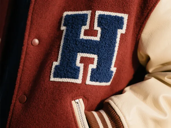
Цветовые блоки – это использование двух или более контрастных, часто ярких цветов на одной тканой этикетке. Эти цвета выделяются благодаря своему резкому контрасту, создавая визуально яркий дизайн, привлекающий внимание. Например, тканая этикетка с черным фоном и белым текстом или сочетанием красного и синего цветов ваша этикетка может стать яркой.
Вот несколько типичных примеров цветовых блоков:
- Черный фон с белыми буквами
- Красный в сочетании с синим
- Желтый с фиолетовым
Эти контрастные сочетания придают тканой этикетке динамичный вид, позволяя вашему логотип бренда или графические элементы, чтобы сделать их более заметными, особенно на одежде или аксессуарах. Помимо визуального эффекта, цветовые блоки могут значительно повысить узнаваемость бренда и общую привлекательность вашего продукта.
Преимущества цветных блокировок на тканых этикетках
- Повышенная визуальная привлекательность
Высококонтрастные цветовые схемы создают сильный визуальный эффект. тканая этикетка с контрастными цветами мгновенно привлекает внимание, делая логотип бренда более заметным и легко заметным. - Улучшение идентичности бренда
Использование колор-блоков часто ассоциируется с современными и модными дизайнами. Оно добавляет стильный элемент в ваш интерьер. индивидуальные тканые этикетки, помогая отразить уникальную индивидуальность и стиль вашего бренда. - Повышение узнаваемости бренда
Благодаря ярким и контрастным цветам ваш бренд с большей вероятностью будет заметен среди множества похожих товаров. При правильном подходе тканые этикетки с помощью цветной блокировки позвольте потребителям быстро и легко идентифицировать ваш бренд даже на расстоянии.
Проблемы цветовых блоков при производстве тканых этикеток
While блокировка цвета может значительно улучшить дизайн вашего тканые этикетки, это может привести к некоторым сложностям в процессе производства. Ниже приведено несколько моментов, которые следует учитывать:

1. Осыпание краев и выцветание цвета
Из-за резкого контраста цветов любые производственные дефекты в процессе ткачества могут привести к выцветанию или растрёпанию краев. Это может нарушить чистоту линий вашего изделия. тканая этикетка дизайн. Чтобы избежать этого, необходимо использовать высококачественные технологии ткачества и обеспечивать строгий контроль качества в процессе производства.
2. Точность обработки кромок
Отделка краев тканая этикетка Должны быть безупречными. Если края не идеально выровнены, контрастные цвета могут не совпадать, что приведёт к искажению изображения. Точность краев особенно важна для тканые этикетки с цветными блоками поскольку даже небольшие несоответствия могут испортить общий дизайн.
3. Сложное сопоставление цветов
Для создания цветовых блоков часто требуется использование нитей разных цветов. Точное сочетание этих нитей крайне важно для достижения желаемого результата. Неточность подбора нитей может привести к небольшим отклонениям в цвете, что негативно скажется на общем эстетическом виде изделия. тканая этикеткаПри выборе цветов для дизайна с цветовыми блоками крайне важно убедиться, что пряжа точно соответствует желаемому оттенку.
Советы по дизайну и созданию образцов тканых этикеток с цветными блоками
Создание тканые этикетки с цветными блоками требует тщательного продумывания дизайна и процесса производства. Вот несколько советов, которые помогут обеспечить успех вашего дизайна этикетки:
- Избегайте тонких линий и мелкого шрифта
Цветовые блоки наиболее эффективны при использовании жирных, крупных форм и букв. Использование тонких линий или мелкого шрифта может привести к размытию деталей, особенно при использовании контрастных цветов. Создавайте простой дизайн и избегайте чрезмерно детализированных элементов, которые могут потеряться в процессе плетения. - Управление цветовым контрастом
Хотя высокая контрастность — ключевой элемент колор-блокинга, важно сбалансировать интенсивность цветов. Слишком сильный контраст, например, использование флуоресцентных или слишком насыщенных цветов, может быть подавляющим и даже неудобным для восприятия. Выбирайте цвета, которые дополняют друг друга, но при этом создают сильный визуальный эффект. - Сообщить о возможных цветовых диапазонах
Различные ткацкие станки имеют ограничения в цветопередаче. Важно обсудить с производителем возможную цветовую палитру до окончательного утверждения дизайна. Это поможет избежать непредвиденных цветовых расхождений в процессе производства. - Используйте физические образцы для окончательного утверждения
Цвета на экране могут выглядеть иначе, когда они вплетены в этикетку. Всегда лучше запросить физический образец вашего продукта. тканая этикетка Прежде чем приступить к полномасштабному производству, необходимо убедиться, что конечный продукт соответствует вашему замыслу.

Вывод: улучшите свой бренд с помощью тканых этикеток с цветными блоками
Цветовая блокировка — это фантастический способ добавить индивидуальности и визуальной привлекательности вашему интерьеру. тканые этикеткиИспользуя контрастные цвета, вы можете выделить свой бренд и повысить его узнаваемость на рынке. Однако, как и в случае с любым дизайнерским приёмом, важно понимать возникающие сложности и планировать работу соответствующим образом. Обеспечивая точность производственных процессов и тщательно подбирая цвета, вы можете создать тканую этикетку, которая не только отлично выглядит, но и подчёркивает индивидуальность вашего бренда.
Если вы рассматриваете возможность включения блокировка цвета в ваш индивидуальные тканые этикеткиНе забудьте выделить время, чтобы четко донести до производителя ваши ожидания от дизайна. При правильном подходе ваш тканые этикетки произведет неизгладимое впечатление на ваших клиентов.