Le etichette tessute sono un elemento chiave del branding nella moda e nell'abbigliamento. Fungono da firma, offrendo l'opportunità di comunicare la personalità e lo stile del marchio. Una delle tecniche di maggior impatto nel design delle etichette tessute è blocco di colore, che può portare l'impatto visivo della tua etichetta a un livello superiore. Tuttavia, per quanto semplice possa sembrare, il color blocking presenta una serie di sfide. In questo articolo del blog, esploreremo cos'è il color blocking, come può migliorare l'identità del tuo marchio e le considerazioni da tenere a mente quando implementi questa tecnica di design nel tuo etichette tessute.

Cos'è il color blocking nelle etichette tessute?
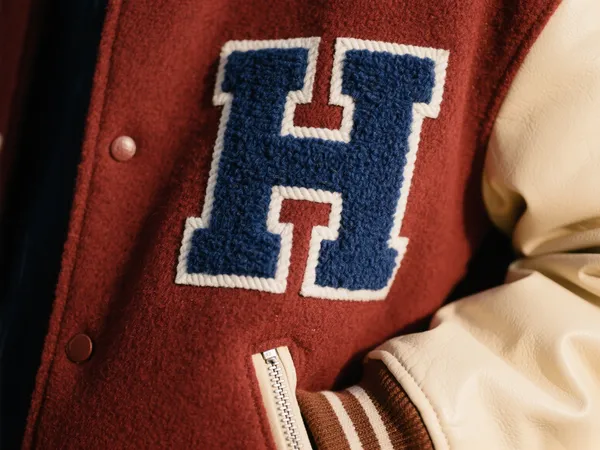
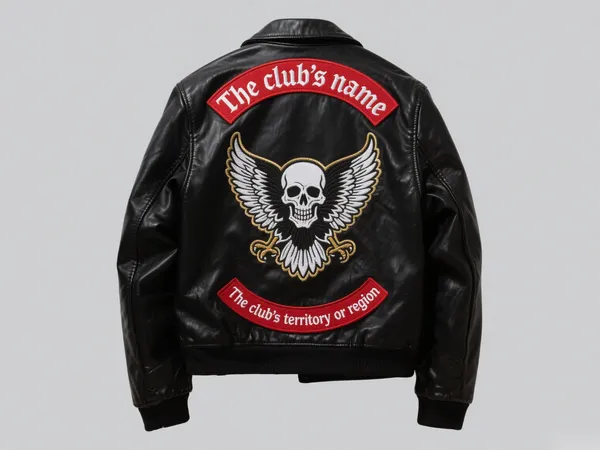
Il color blocking si riferisce all'uso di due o più colori contrastanti, spesso audaci, all'interno della stessa etichetta tessuta. Questi colori risaltano per il loro netto contrasto, creando un design visivamente sorprendente che cattura l'attenzione. Ad esempio, un etichetta tessuta con uno sfondo nero e testo bianco, o una combinazione di rosso e blu, puoi far risaltare la tua etichetta.
Ecco alcuni esempi tipici di color blocking:
- Sfondo nero con scritte bianche
- Rosso abbinato al blu
- Giallo con viola
Queste combinazioni ad alto contrasto conferiscono all'etichetta tessuta un aspetto dinamico, consentendo logo del marchio o grafica per renderli più visibili, soprattutto se applicati su abbigliamento o accessori. Oltre a distinguersi visivamente, il color blocking può migliorare significativamente la riconoscibilità del marchio e l'attrattiva generale del prodotto.
Vantaggi del Color Blocking nelle etichette tessute
- Maggiore appeal visivo
Le combinazioni di colori ad alto contrasto creano un forte impatto visivo. etichetta tessuta con colori contrastanti cattura immediatamente l'attenzione, rendendo il logo del marchio più evidente e più facile da individuare. - Miglioramento dell'identità del marchio
L'uso del color blocking è spesso associato a design moderni e alla moda. Aggiunge un elemento di stile al tuo etichette tessute personalizzate, contribuendo a riflettere l'identità e lo stile unici del tuo marchio. - Riconoscimento del marchio migliorato
Con colori audaci e contrastanti, il tuo marchio avrà più probabilità di essere notato in un mare di prodotti simili. Se fatto correttamente, etichette tessute con il color blocking consenti ai consumatori di identificare il tuo marchio in modo rapido e semplice, anche da lontano.
Sfide del color blocking nella produzione di etichette tessute
While blocco di colore può migliorare notevolmente il design del tuo etichette tessute, presenta alcune sfide durante la produzione. Di seguito sono riportati alcuni aspetti da considerare:

1. Sfilacciamento dei bordi e perdita di colore
A causa del forte contrasto tra i colori, eventuali imperfezioni di fabbricazione nel processo di tessitura possono causare sbavature di colore o bordi sfilacciati. Ciò può compromettere le linee pulite del tuo etichetta tessuta progettazione. Per evitare ciò, è essenziale utilizzare tecniche di tessitura di alta qualità e garantire un controllo di qualità preciso durante la produzione.
2. Precisione nella finitura dei bordi
La finitura del bordo del etichetta tessuta deve essere impeccabile. Se i bordi non sono perfettamente allineati, i colori contrastanti potrebbero disallinearsi, con conseguente aspetto distorto. La precisione dei bordi è particolarmente importante per etichette tessute con blocchi di colore poiché anche piccoli disallineamenti possono compromettere il design complessivo.
3. Abbinamento colori complesso
Il color blocking spesso richiede l'uso di fili di diversi colori. Abbinare questi fili con precisione per ottenere il design desiderato è fondamentale. Un abbinamento impreciso dei fili può portare a leggere variazioni nei colori, compromettendo l'estetica generale del capo. etichetta tessutaQuando si scelgono i colori per un design color-block, è fondamentale assicurarsi che i filati corrispondano esattamente alla tonalità desiderata.
Suggerimenti per la progettazione e la campionatura di etichette tessute a blocchi di colore
Creazione etichette tessute con blocchi di colore richiede un'attenta valutazione del processo di progettazione e produzione. Ecco alcuni suggerimenti per garantire il successo del design della tua etichetta:
- Evita linee sottili e caratteri piccoli
Il color blocking è più efficace con forme e lettere grandi e audaci. L'uso di linee sottili o caratteri piccoli può causare dettagli sfocati, soprattutto quando si utilizzano colori ad alto contrasto. Mantenete il design semplice ed evitate elementi eccessivamente dettagliati che potrebbero perdersi nel processo di tessitura. - Controlla il contrasto del colore
Sebbene l'elevato contrasto sia una caratteristica fondamentale del color blocking, è importante bilanciare l'intensità dei colori. Un contrasto eccessivo, come l'uso di colori fluorescenti o eccessivamente saturi, può risultare eccessivo e persino difficile da guardare. Scegliete colori che si completino a vicenda, mantenendo comunque un forte impatto visivo. - Comunicare gamme di colori realizzabili
Le diverse macchine per tessere presentano limitazioni in termini di riproduzione del colore. È fondamentale comunicare con il produttore la palette di colori realizzabile prima di finalizzare il progetto. Questo aiuta a prevenire discrepanze di colore impreviste durante la produzione. - Utilizzare campioni fisici per l'approvazione finale
I colori sullo schermo possono apparire diversi quando vengono intrecciati in un'etichetta. È sempre meglio richiedere un campione fisico del tuo etichetta tessuta prima di procedere con la produzione completa. Questo contribuirà a garantire che il prodotto finale corrisponda al design che avete immaginato.

Conclusione: valorizza il tuo marchio con etichette tessute color-block
Il color blocking è un modo fantastico per aggiungere personalità e appeal visivo al tuo etichette tessuteSfruttando i colori a contrasto, puoi far risaltare il tuo marchio e migliorarne la riconoscibilità sul mercato. Tuttavia, come per qualsiasi tecnica di design, è essenziale comprenderne le sfide e pianificare di conseguenza. Assicurando processi di produzione precisi e scegliendo attentamente i colori, puoi creare un'etichetta tessuta che non solo ha un aspetto accattivante, ma rafforza anche l'identità del tuo marchio.
Se stai pensando di incorporare blocco di colore nel tuo etichette tessute personalizzate, ricordati di prenderti il tempo necessario per comunicare chiaramente le tue aspettative di progettazione al produttore. Con il giusto approccio, il tuo etichette tessute lascerà un'impressione duratura sui tuoi clienti.